Finding The Perfect Component
Since starting my latest project I wanted a select box with a bit more style than the default HTML select. TailwindUI had exactly what I was looking for with their Select Menu with avatar.
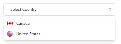
You can checkout the source on Github and a live demo.
Making An Easily Reusable Component
The select I found was exactly what I wanted but it needed to be easily reusable across many forms. The following was just to much to copy and paste on many different forms and would be difficult to maintain.
<template>
  <Listbox
    v-model="selected"
    as="div"
    :value="modelValue"
    @update:modelValue="value => emit('update:modelValue', value)"
  >
    <div class="relative mt-1">
      <ListboxButton
        class="relative w-full cursor-default rounded-md bg-white pt-2 pb-2.5 pl-3 pr-10 text-left text-gray-900 shadow-sm ring-1 ring-inset ring-gray-300 focus:outline-none focus:ring-2 focus:ring-indigo-500 sm:text-sm sm:leading-6"
      >
        <span class="flex items-center">
          <img
            v-if="selected && selected.avatar"
            :src="selected.avatar"
            alt=""
            class="h-5 w-5 flex-shrink-0 rounded-full"
          />
          <span class="ml-3 block truncate">{{ selectedName }}</span>
        </span>
        <span
          class="pointer-events-none absolute inset-y-0 right-0 ml-3 flex items-center pr-2"
        >
          <ChevronUpDownIcon class="h-5 w-5 text-gray-400" aria-hidden="true" />
        </span>
      </ListboxButton>

      <transition
        leave-active-class="transition ease-in duration-100"
        leave-from-class="opacity-100"
        leave-to-class="opacity-0"
      >
        <ListboxOptions
          class="absolute z-10 mt-1 max-h-56 w-full overflow-auto rounded-md bg-white py-1 text-base shadow-lg ring-1 ring-black ring-opacity-5 focus:outline-none sm:text-sm"
        >
          <ListboxOption
            as="template"
            v-for="option in options"
            :key="option.value"
            :value="option"
            v-slot="{ active, selected }"
          >
            <li
              :class="[
                active ? 'bg-indigo-600 text-white' : 'text-gray-900',
                'relative cursor-default select-none py-2 pl-3 pr-9',
              ]"
            >
              <div class="flex items-center">
                <img
                  v-if="option.avatar"
                  :src="option.avatar"
                  alt=""
                  class="h-5 w-5 flex-shrink-0 rounded-full"
                />
                <span
                  :class="[
                    selected ? 'font-semibold' : 'font-normal',
                    'ml-3 block truncate',
                  ]"
                  >{{ option.label }}</span
                >
              </div>

              <span
                v-if="selected"
                :class="[
                  active ? 'text-white' : 'text-indigo-600',
                  'absolute inset-y-0 right-0 flex items-center pr-4',
                ]"
              >
                <CheckIcon class="h-5 w-5" aria-hidden="true" />
              </span>
            </li>
          </ListboxOption>
        </ListboxOptions>
      </transition>
    </div>
  </Listbox>
</template>
The Final Result
The final result is a simple component that takes 3 props.
v-model to bind the selected value to a variable.
:options to pass the array of objects that represent the select options.
placeholder a text value that is displayed when a value hasn’t been selected yet.
<SelectBox
  v-model="form.country"
  :options="countryOptions"
  placeholder="Select Country"
/>